Control Web UI Redesign
With my five years in the ConnectWise Control team, I work as a front-end developer and a UIUX designer. My main focus is to build a fast, responsive, intuitive web app with cross-browser compatibility.

OverView
During the five years in Control, I am honored to directly work with our CTO, Jake Morgan. I learn a lot from him, not just coding skills but also the spirit of paying attention to details, embracing innovation, and loving your work. Jake always encourages me to make myself productive. So even my title is a software engineer, I can still have the freedom to spend half of my time visualizing ideas and bridging the gap between PM and Dev Team.
Our 12,000 partners will see the host page of the web app daily. Any bug or even a misplace of the button will cost us millions of dollars. So redesigning the host page has become the top priority. Since 2015, we have redesigned and modified the layout every two years to match the latest design trend or ConnectWise Style Guide. Below are the works I did for the web app, mainly on the host page.
Responsive design
Not all the technicians will debug remotely on their mobile phones, but mobile does provide extra flexibility. However, our web app is not designed for mobile in the first place, so much text turns to ellipsis on small windows.
To make it fit the mobile view, I added breakpoints in CSS to create three different layouts for different use cases:
-
Desktop View
-
Tablet View
-
Mobile View
To fit everything into the mobile view, I hide the global navigation and session group list under the menu icon and collapse the detailed info below the session list.


Besides the layout, I also did the following to make sure the responsiveness:
-
Use percentage instead of arbitrary hard-coded pixel values for container panels.
-
Reduced padding and margin on mobile view.
-
Ensure all the clickable areas are larger than 32x32 px to ensure users can click on items with a finger without first zooming in.
-
Hide trivial elements and leave the only essential part for mobile view.
-
Customize the tooltips for icons, and show them on mobile while clicking.
Theming
We have more than 18 themes. The light theme has ten shades of gray, and we map them to the Dark theme color palette carefully. I also removed a lot of borderlines in the dark theme if two grays have enough contrast.


Performance optimization
To optimize performance is an open-ended question. I used the Chome dev tool to check the bottleneck, and then I split the problem into multiple independent issues, like:
-
Does CSS filter (grayscale filter remove saturation from the PNG)affect the loading time?
-
How does CSS animation effect the performance?
-
Is the algorithm to update the session table row efficient enough, or shall we replace the whole table instead of finding and replacing rows?
-
What is the most efficient CSS selector? If I add CSS class to repeated elements, does that make a difference?
After hundreds of tests, I found:
-
replace CSS filter with two PNGs will save 163ms;
-
put animation on the correct elements will save 137ms;
-
change the way we update the table will save 480ms;
-
add a class name for CSS selector can save 270ms.
Combining all the findings and savings, I can save 1050ms from the loading time.

user flow redesign
Among all the user flows, one of the most important ones is the session creation user flow. If users can create a session and successfully remote to a machine the first time they use CW Control, then the conversion rate of those users will be much higher than those who failed. We have our data team keeping track of our conversion rate for a different sample of people.
The current user flow looks like the image blew:
-
Step 1: Click the + icon on the navigation bar to open a modal dialog
-
Step 2: Name your session and pick a Join Mode
-
Step 3: Open the Invite modal by clicking the Invite button on the toolbar and selecting an invitation method from there.
-
Step 4: Double click the session to join the session.

There are a couple of issues with this flow:
-
Step 1: There are multiple + buttons on the left. The user may not understand what the difference between the Support, Meet, and Access session is.
-
Step 2: Users need to name each session and pick a Join Mode before the session got created. They may not know the difference between 4 join modes and need to read through the text to understand which one to pick.
-
Step 3: Back to the main page, but not sure what to do next. The Invite button is not very prominent on the screen.
-
Step 4: After inviting a guest to join the session, the user does not know how to join it themselves. We provide three ways to join: double-click session, use the Join button next to the Invite button, or use the right-click context menu.
After discovering the pain points, I create multi designs to resolve the pain point for each step, build prototypes for user testing, create extensions and work with the Data team to do A/B tests and finally implement what I designed to production.
-
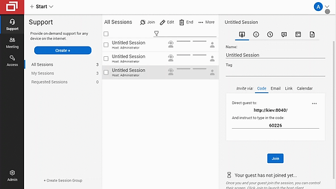
Here is what the new design looks like:

The new design solved pain point I found in the ideation phase for each step:
Step 1:
-
We provide a description of what is a Support session right next to the Create + button.
-
Make the Create + button the most prominent button on the page. (The A/B test from the Data team shows if we move that button away to a different place, it will cost us half a million for annual revenue)
-
Create session immediately after the user clicks Create + and shows all the details in the detail info panel.
Step 2:
-
Users do not have to name a session every time anymore. The default session name will pop up.
-
For those who want to rename the session, we made the process easy for them as well. The session name text field will be on focus after the session gets created.
Step 3:
-
Put Invitation methods right under the session property text fields
-
Show the invitation method directly without using a modal
-
Use tabs to organize different invitation methods without crowed the page
Step 4:
-
Even though we have already provided three ways to join, according to the A/B test and user interview, we found that having a Join button below the invitation panel could help users finish the last step.
-
With the Join button there, steps 2 to 4 are in a vertical flow. The user can scan from top to bottom in one place. No jumping around is required.
Functional Animation
After performance optimization to make our web UI fast, responsive design and latest style to make UI look nice, UX improvement to make it more user friendly, I want to move one step further and bring UX to the next level. It's time to add a bit of love to the product. So I did my research and found functional animation.
Functional animation is subtle animation that has a clear, logical purpose. It reduces cognitive load, prevents change blindness, and establishes a better recall in spatial relationships. There are five key aspects of functional animation:
1. Responsive
Visual feedback is a crucial part of interaction design. After the user clicks on an End button, we show the feedback by fading in the backdrop and sliding in a modal.

2. Associative
When users click on a particular element and respond with a new surface, we need to associate newly created surfaces to the element or action that generates them. The first GIF on the bottom shows a menu that appears right from the touchpoint.
3. Natural
Every movement in digital interfaces should be inspired by forces in the real world. In the real world, an object’s ability to speed up or slow down quickly is affected by weight and surface friction. Similarly, starts and stops do not occur instantaneously. The second GIF on the bottom shows an empty state image, simulation a drag and bounce effect in the real world.

4. Intentional
Motion, by its nature, has the highest level of prominence in a user interface. The first GIF on the bottom shows when the page loads, session group panel, session list, and detail panel slide in from left to right with a different speed. The session group panel slides in first, then the session list and the detail panel animation will be the last to stop. This design is to indicate our hierarchy is from left to right.
5. Quick
When elements move between states, the movement should be fast enough, so users don’t have to wait yet slow enough to understand the transition. The second GIF on the bottom shows a quick fade-in animation to give visual feedback on which parts have been updated.


Other UIUX improvements
1. Distinguish tabs by adding signifiers
Sometimes I have to ask Whys to understand what the user has been asked for. For example, one of the tickets says users want to customize the background color for each detailed tab, as shown in the bottom left. After some follow-up questions asked, we found the issue is user had a hard time differentiating different tabs. Chat, Command, and Note tabs share the same CSS. Users sometimes accidentally send an internal message to guests while trying to take a note.
To solve the issue, I redesigned each tab. For the Chat tab, I use message bubbles. Command tab, I use the console style. For the Note tab, I made them look like sticky notes. With the use of the CSS pseudo-elements, I can solve the UI issue purely using CSS. Here is what it looks like after the change:

2. Differentiate license packages by illustrations
Our package selection modal provides prices for users to choose from. They usually need to jump to the marketing website to understand the cost and what each package does before selecting the modal. Here I illustrate the difference between each package.
For example, Standard Package lets a technician remote to any number of machines but only three devices simultaneously. I use blue dots to indicate technician's machine, green dots to indicate connected session, gray dots to mean potential machines technician could connect to.

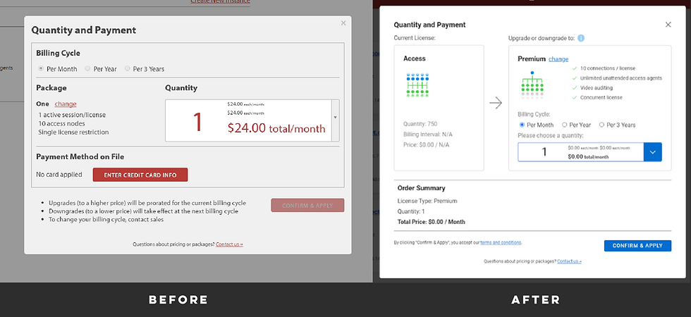
3. Illustrator transition process with a visual hint
For the payment modal, the previous design does not give you current license info. Users want to know what license they are on and where they are transferring to. So I designed this UI to show that transition.


